
JPFO alerts preferences - Poll
![]()
8/24/12 - poll now complete - results page can be found here.
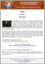
If a subscriber to our email alerts ((sign ups here - top of page), we would like feedback with regard to our formatting, which has been in html for just over a year. The "usual" format has been a font size of 10 point for the content, plus small thumbnail pictures. The content usually gives some description of a new news item or essay and provides a link to a JPFO.org page to view the whole article.
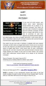
We are aware that some people might prefer larger text and also bigger images. A down-side of this is that you may have to scroll down a lot more. Much can depend on an individual's screen and resolution settings.
The two thumbnails below will enlarge when clicked on so - please compare the "usual" on the left with the "extra'' on the right and cast your vote in the first poll below regarding your preference.To view the expanded images, click on the lower right "X' icon. Bear in mind that most email programs as well as browsers these days have a "zoom" option to permit making a page larger if required and so easier to read.
We'd also like input on actual alert content quantity. We wonder if you would prefer to have an entire article included in your alert or whether you are happy with an alert that just gives an introduction and a link to the JPFO web site. Please vote in the second poll below.
(Voting is limited to one vote in each poll).
![]()
Question #1 - "Usual" font size or "Extra"?
![]()
Question #2 - Entire article or introduction and link?
Thank you very much for participating in this JPFO poll.
© Copyright Jews for the Preservation of Firearms Ownership 2012


